this is the paper from ny central supply
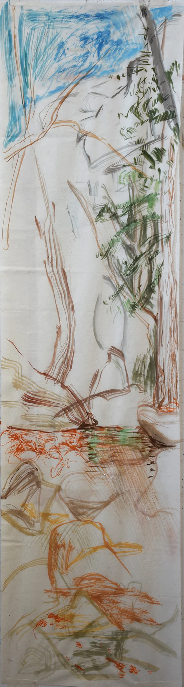
2:30 PM: today i taped 2 japanese papers to my studio wall, side by side, to see which one works best for my creek scroll series. the piece from the roll i purchased on friday in denver is whiter in color and thinner in width. i don't love how it takes the color; it's less absorbent. the paper i found a few weeks ago, hiding in my studio, which i had purchased years ago at the now defunct ny central supply, has more of a cream color and takes the gouache colors in a much more painterly way. it's a bit more absorbent, so the brush strokes are more diffused and less precise. the problem is, the ny central paper came in packaging with only japanese letters, so i have no idea how to find it again.
next time we're in denver, i'm going to visit a store which specializes in japanese paper and see whether i can find something closer to what i got in nyc. since that's what they specialize in, i may find something even better. and it's possible, if i bring the packaging info with me, someone in that store may know how to read it.
mikela walked over a while ago & reminded me that i have a bunch of narrow strips of canvas, which are remnants from pieces i had cut for specific size stretcher bars. they're perfect for the experiments i want to do in oil on canvas. i want to see if i can find a middle ground between these more calligraphic paintings on paper and the landscape oils i made in the past, many of which have the thicker aplication of paint characteristic of oil. that would also allow me to use the tinted ground i learned about in greece; a beige colored overall color that allows, for example, the whites of the rushing water to pop and gives an overall tone to the painting that brings to mind byzantine prototypes.