day 2 of tokyo olympics 16 by Philip Tarlow

tokyo olympics 16 as it looked at the end of my painting day today

2:26 PM: i did some more painting on tokyo olympics 16 this morning, so it’s now more complex than it was, but hopefully not too busy. many patterns going on simultaneously…the clincher may happen tomorrow. morning, when i’m fresh.

BELOW: yesterday’s version with today’s

tweaks to "roiling creek 2" / starting "tokyo olympics 16," 15 1/2 x 37 1/4” by Philip Tarlow

3:10 PM: i collaged the paper i had taped to this painting yesterday afternoon to see whether it worked or not. when i came in this morning, it was clear that the painting improved with the collaged piece, so i proceeded to attach it permanantly. the straight line where the collaged map above the rock at the top of the composition was bothering me, so i broke it up. there are i few other things i’m just now noticing, which i’ll address tomorrow morning.

DETAIL of the green marks breaking up the straight edge of the collaged map


then i started a new one: tokyo olympics 16, which you see here in stage 1. while it has elements of previous oils in the series, thus far it has a beautiful, elegant simplicity that i’d like to maintain throughout the process. the yellows were inspired by an 18th c. japanese woodblock print.

tokyo olympics 16, 15 1/2 x 37 1/4” oil on triple primed portrait linen

"roiling creek 2" a major intervention today by Philip Tarlow

4:01 PM: i made a last minute change, which is temporary unless i decide tomorrow morning, to callage that piece of white paper on the left, which right now is just taped down and can be removed easily.

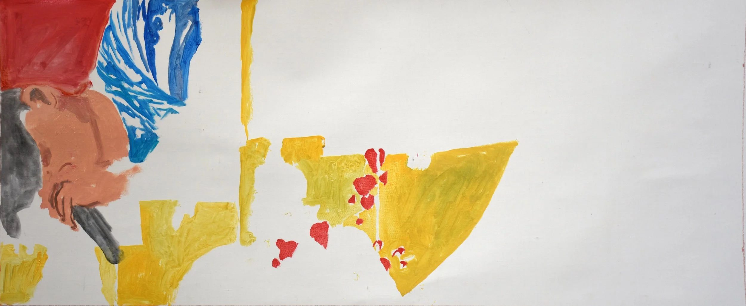
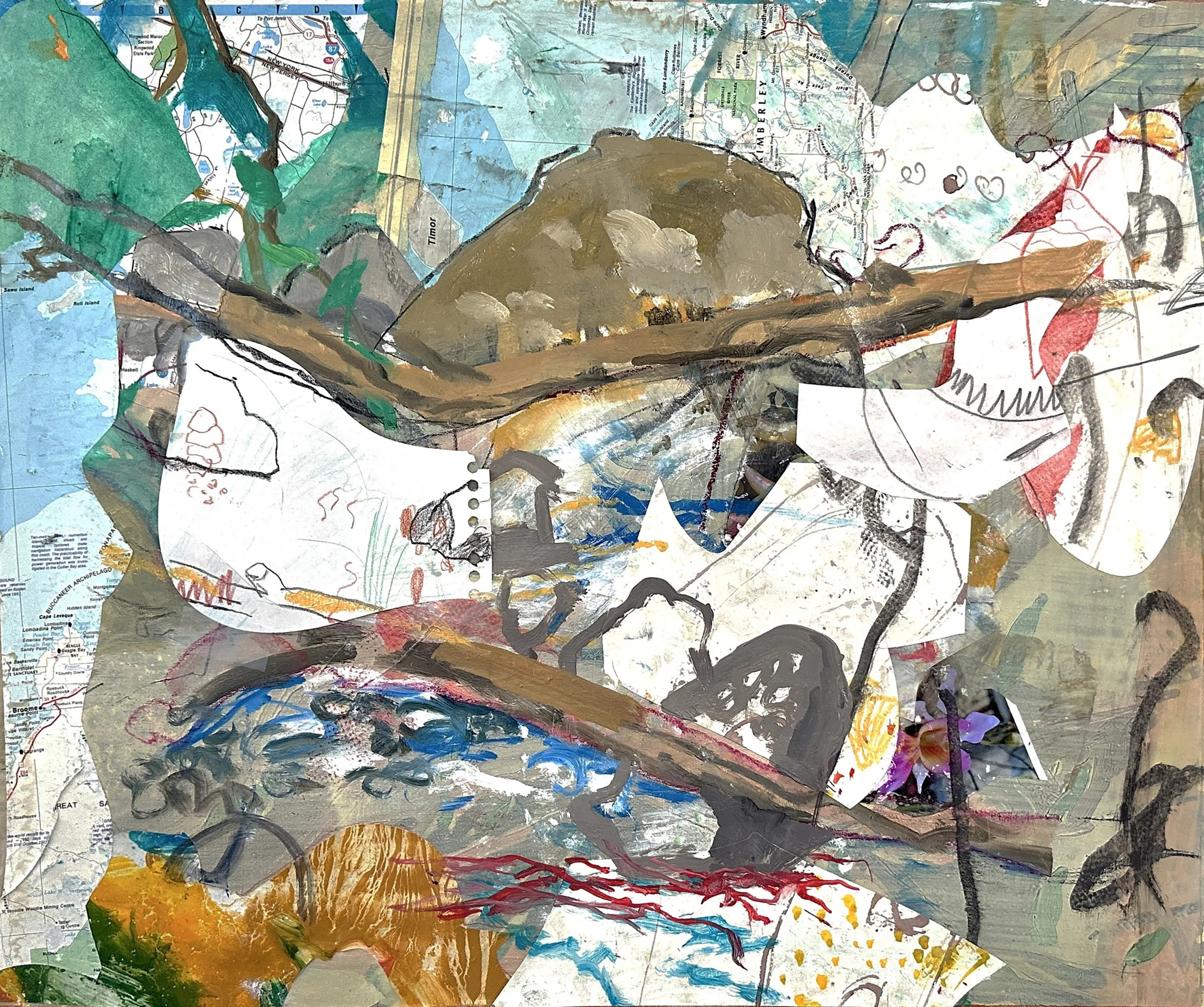
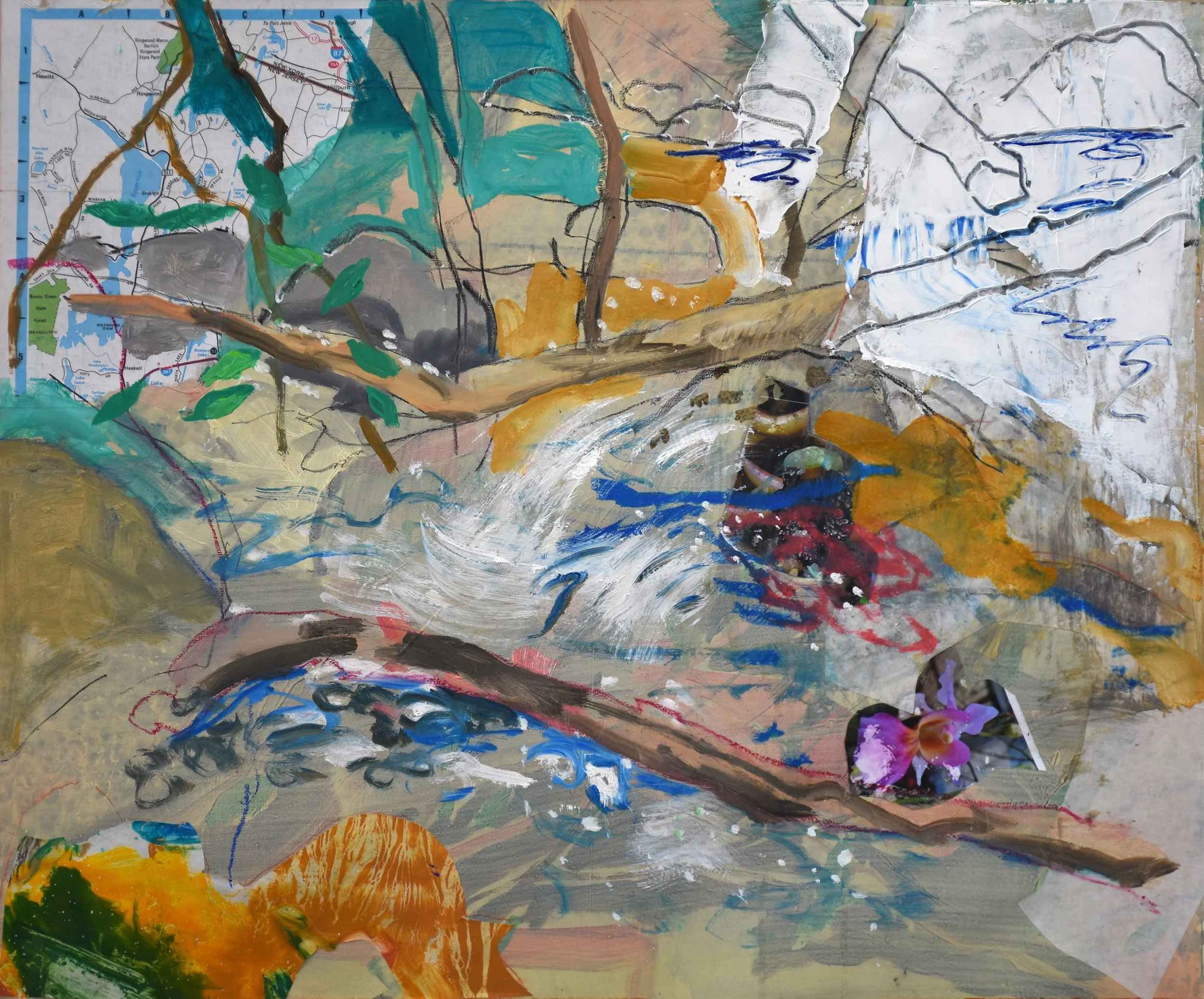
2:28 PM: when i entered my studio this morning & glanced at roiling creek 1 & 2, i realized immediately that my problem yesterday & the day before, when i did most of the work on #2, was that i was trying to create a companion piece to #1. in art, trying never works.

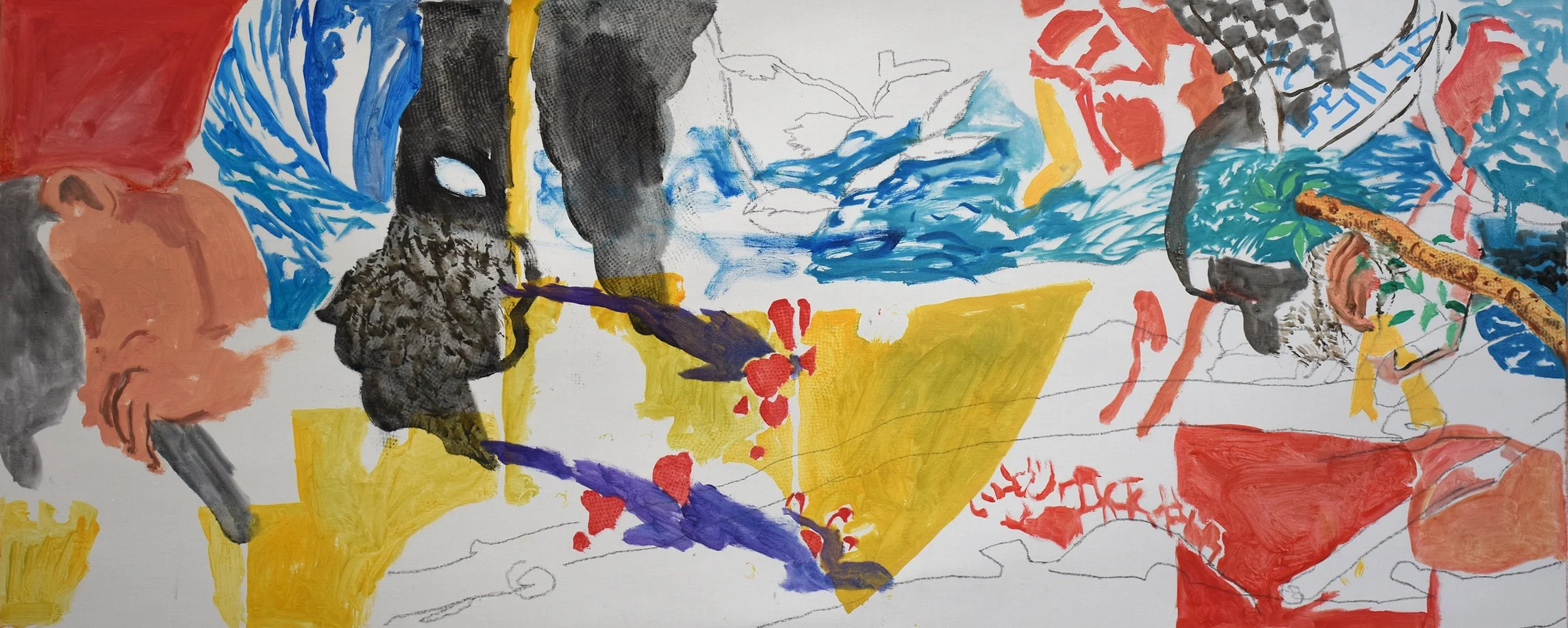
so, feeling free from the need or desire to create a painting that would look like it should be hanging next to #1, i got to work with a freedom and, dare i say, bravado that was missing over the past two days. i was, however, able to maintain some elements of the previous version, but for all intents and purposes, it’s a brand new painting.

i did a fair amount of collaging, using maps and drawings i had made months ago with the intention of cutting them up and using them as collage elements in a painting or paintings.

i also made some marks that echo japanese script, based on 18th c. japanese paintings. only one remains as of now, and it’s in the lower right corner of the composition.

what i notice, as i sit in my usual typing spot, about 25 feet from the wall where the paintingis currently positioned, in the space. whereas roiling creek 2 was jammed up, it now breathes; even sings!

BELOW: the before (left) and after

"roiling creek 2" tweaks by Philip Tarlow

10:57 AM: i had a little time in the studio this morning, but will be out the rest of the day.

ling creek 1iwhile gazing at roiling creek 2 last night, my eye caught something i wanted to tweak this morning. if you look at my post yesterday and carefully observe roiling creek 1, and the rocks in the upper central portion of the composition, you’ll see that the dominant ones have a dark ouline. i felt that would likely make a significant difference in roiling creek 2, so in the short amount of time i had, i made that addition, which i think works.

BELOW: before (left) and after my tweaks this morning

roiling creek 2 17 1/2 x 21" by Philip Tarlow

roiling creek 2 17 1/2 x 21” oil & collage on linen, as it looked at the end of my painting day today

3:28 PM: today i started what could be considered a commission. mikela has been asking my whether i could make a painting that could be shown next to roiling creek 1, which was painted last year and has been one of her favorites. I’ve been contemplating it for about a month, and finally i felt like today was the day.

because of the nature of roiling creek 1, i felt it was best to not use a fresh piece of primed white portrait linen. so i searched through my storage area and came across a 36x36” painting i had started about 4 months ago. i was not happy with it, so i painted over it with a thin layer of tan-ish oils, rolled it up & stored it.

so i removed it from the storage space and cut it down to accomodate a painting exactly the same size as roiling creek 1: 17 1/2 x 21”

as i worked this morning, i kept glancing over at roioling creek 1 to get a feel for the vibe, since it was painted so many months back & i’m now in a different space. so far, i’m feeling good about it. it has that same energy as the original, a similar composition and colors….i’ll know better when i look at it with fresh eyes on thursday, since i won’t be in the studio tomorrow.

BELOW: the original painting, roiling creek 1 is on the left.

tweaks to "cottonwood creek 2" / tweaks to “dancing skateboarder” by Philip Tarlow

once i completed tweaks to cottonwood creek 2, i decided to make some adjustments to dancing skateboarder, which i hadn’t worked on since 1/28/22, or almost exactly one year.

if you study the BEFORE and AFTER below, you will observe some subtle but important changes. look at the top of his hat, and you’ll see a dark blue line separating the hat form the background & making it stand out more. the same goes for his left sleeve, where the cuff is more accented. and finally, if you have a look at the red area above his head, you’ll see some shadows that weren’t there before. that’s it for now. i’ll cast gazes at it throughout the rest of the afternoon & see if there’s anything else i’m moved to do.

at work this morning on cottonwood creek 2 16x37 1/2” oil on portrait linen

111:02 AM: before leaving for school this morning, mikela stopped by to have a look at cottonwood creek 2. she gave me valuable and, i think accurate feedback on a few areas of the composiiton, which i’ve been addressing over the past few hours.

firstly, she observed that the area of black in the upper central portion of the composition was too much, and pulled the eye away from the rest of the composition. secondly, she felt that the area of red just below that somehow needed breaking up. and finally, she felt the area on the lower right, which was drawn in but not painted, needed a little something along the lines of the area of rocks & water on the lower left.

the BEFORE and AFTER can be seen BELOW

“cottonwood creek 2” day 2 by Philip Tarlow

cottonwood creek 2 16x37 1/2” oil on portrait linen, following today’s work

1:32 PM: i continued work on cottonwood creek 2 this morning, following the discoveries i made with cottonwood creek 1 a few days ago, which by the way feels like a few decades ago. a muted black, reds & yellows play a critical role in transitioning this painting from a creek-scape to a mystery-scape. the central blue form, derived from the costume of a tokyo olympics skateboarder, gives the eye pause; is this a windblown version of the tree trunks on the upper right, or….and what does “this image” refer to?

i love the way i’ve been starting these first two cottonwood creek series paintings, with realist elements inspired by photos i shot a few years back during one of my plein air sessions at nearby cottonwood creek.

the relationship between these descriptive marks identifying rocks, water & branches and the geometric primary colored patterning is left to the viewer to decipher. but that muted black is where the imagination keeps returning, taking the eye further back than the blue sky on the upper right, into an unknown territory.

a lifetime of observing and painting the landscape laid the groundwork for this moment.

today’s palette

at work this morning on cottonwood creek 2

"cottonwood creek 1" day 2 / starting “cottonwood creek 2” by Philip Tarlow

cottonwood creek 2, 16x37 1/2” in a very early stage of development today

2:30 PM: i stopped work on cottonwood creek 1 earlier today. usually if i’m uncertain as to whether a painting is fully resolved, it helps to move on to something new, all the while casting glances at the previous one. my latest such glance indicated to me that i may need to do a bit more; i’ll know better in the morning.

so i started work on cottonwood creek 2, which has the exact same dimensions: 16x37 1/2.” these dimensions in inches are designed to translate easily into rounded off centimeters to make it easier for the gallery in athens to have stretcher bars ready and waiting when i arrive once ii send them those dimensions. so, for example, these two canvases come out exactly to 95x41 cm.

cottonwood creek 2 is at a very early stage and will develop further tomorrow. i worked on it with my usual second energy burst, which happens around 1pm and peters out right about now. it’s cool switching from the tokyo olympics figures, which are dancing, jumping and colorfully dressed, to thes landscape inspired new paintings. cottonwood creek is one of our local creeks where i go to paint plein air during the warmer months. i use those works on paper and the photos i shoot while i’m there, to create studio paintings which, ideally, capture the energy of the creeks, with their roaring streams of water, fallen tree trunks and rocks glistening in the afternoon sun.

11:45 AM: earlier this morning, i took cottonwood creek 1 further. the red on the upper right was my most recent move, unexpectedly taking it from the realm of pure landscape and bringing it closer to my tokyo olympics series in color & composition, as you can see in this shot of it with a few tokyo olympics series works.

the lower portion of the composition consists of a drawing, with no colors other than the bit of blue on the lower right.

cottonwood creek 1 with some tokyo olympics series

taking tokyo olympics 14 to the next level by Philip Tarlow

12:09 PM: it’s a sunny, bitterly cold day today. when we got up this morning, it was -5°F. right now it’s up to 17° F.

although i had thought tokyo olympics 14 was complete, and i was oging to leave it very spare, today i was moved to go back into it, starting with the skateboard. i had made a small watercolor/gouache on paper, with some collage in november of 2021. i liked what happened with the collaging on the skateboard, so i used that as a model for this one in oils.. then i decided to go further with his trousers, which have a wonderful patterning in browns. i like where it’s at right now, so i’m going to call it a day & stop early, since i have a dentist appointment later this aftrenoon.

i think the greens, red & blues of the skateboard enrich the entire composition in an unexpectedly powerful way…now i have to ponder whether adding more color to his shirt will be effective.

BELOW: before & after today’s work